The right Alight Motion Fonts can make a video easier to read, more consistent, and more visually polished. Alight Motion supports text editing and allows users to import their own fonts, giving editors more typography choices than the default options alone.
This guide explains font styles, custom TTF fonts, downloading and importing fonts, licensing, typography effects, language compatibility, and troubleshooting so you can choose fonts based on the type of video you are creating.
What Are Alight Motion Fonts?
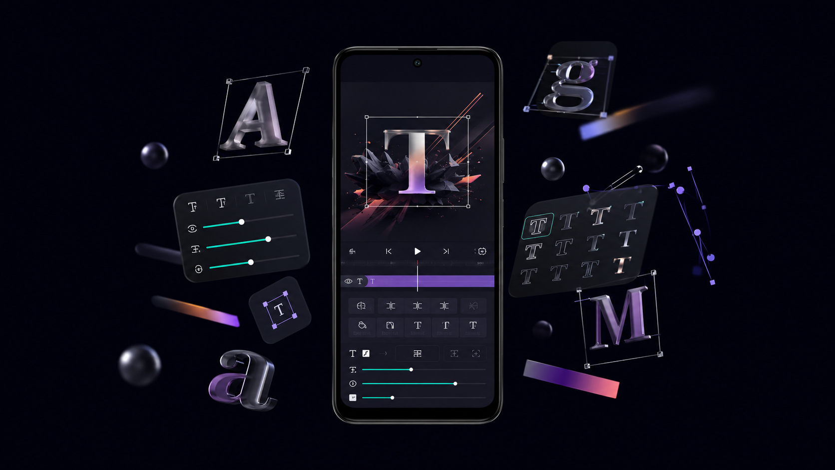
Alight Motion fonts are typefaces used for text layers inside the app. You can work with available fonts or import compatible custom font files when you need a different design.
It is useful to distinguish between a Alight Motion for IOS file, a font style, Unicode fancy text, and text effects. A TTF file is an actual font that can be installed or imported. Unicode fancy text is created from special characters and is not the same thing as importing a new typeface.
Typography also includes properties such as size, weight, spacing, alignment, and positioning. Good font selection matters because viewers need to understand your text quickly, particularly on small mobile screens.
Best Alight Motion Fonts for Video Editing
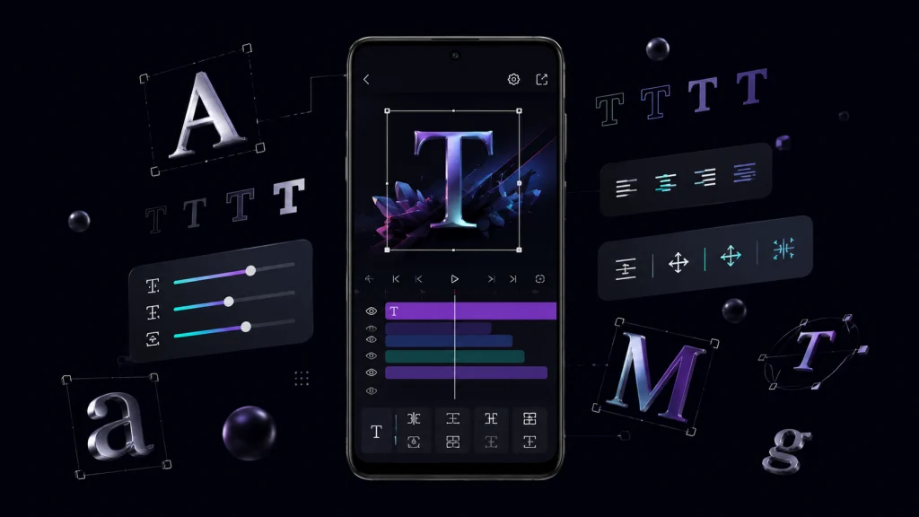
Instead of choosing Alight Motion Fonts only because they look unusual, match the typography to your video’s purpose.
Bold Fonts
Bold typefaces provide strong visual impact and remain readable over busy footage. They work well for titles, announcements, thumbnails, and short-form video captions.
Modern Sans-Serif Fonts
Clean sans-serif fonts have simple letter shapes and are suitable for tutorials, social media content, technology videos, and professional projects.
Condensed Fonts
Condensed fonts use narrower letterforms, allowing more words to fit into limited space. They are useful for vertical videos, headlines, sports edits, and fast-moving captions.
Wide/Extended Fonts
Wide fonts create a spacious, prominent appearance. They can work particularly well for short titles where you want typography to become part of the visual composition.
Handwritten Fonts
Handwritten styles can create a casual or personal feeling. Use them selectively because complicated letterforms can become difficult to read at smaller sizes.
Script Fonts
Script fonts are useful for elegant titles, emotional edits, invitations, and branding. Keep text short and check readability before using them extensively..
Gaming Fonts
Gaming typography often uses strong weights, angular shapes, or futuristic characteristics. It can suit gaming montages, esports-style edits, and energetic short videos.
Cinematic Fonts
Cinematic typography usually favors controlled spacing, clean shapes, and strong contrast. These characteristics work well for film-style titles and dramatic sequences.
Minimal Fonts
Minimal fonts prioritize simplicity and readability. They are a good choice when footage, photography, or animation should remain the main visual focus.
Retro Fonts
Retro-inspired typefaces can reinforce an older visual era or nostalgic theme. Their effectiveness depends heavily on matching the font with the video’s overall design.
Decorative Fonts
Decorative fonts can add personality to specific words or titles. Avoid using them for long paragraphs because unusual letterforms can reduce readability.
Monospace Fonts
Monospace fonts give every character similar horizontal spacing. They can create technical, coding, documentary, or digital-interface aesthetics.
Alight Motion Font Styles for Different Videos
| Video Type | Font Style | Why It Works | Best Use |
|---|---|---|---|
| YouTube | Sans-serif | Clear and versatile | Titles and captions |
| Instagram Reels | Bold/condensed | Easy to notice quickly | Short captions |
| Short vertical videos | Bold | Strong mobile visibility | Hooks and headlines |
| Gaming edits | Bold/futuristic | Energetic appearance | Player names and titles |
| Lyric videos | Script/sans-serif | Supports mood | Lyrics and emphasis |
| Cinematic edits | Minimal/condensed | Controlled appearance | Film-style titles |
| Travel videos | Modern/handwritten | Friendly visual tone | Locations and captions |
| Motivational videos | Bold | Strong emphasis | Quotes and key phrases |
| Fashion edits | Elegant/modern | Polished presentation | Brand and product text |
| Sports edits | Condensed/bold | Fits fast compositions | Scores and player names |
| Meme videos | Bold/decorative | Immediate visual impact | Short punchlines |
| Story videos | Sans-serif | Comfortable reading | Narration and captions |
Alight Motion Fonts Download
When looking for an Alight Motion font download, focus on the actual font file rather than a collection of decorative text characters. TTF (.ttf) is the format recommended by Alight Motion’s official Help Center for custom-font importing. If the font comes inside a ZIP or RAR archive, extract it before importing.
Also check the Alight Motion Mod APK Download license. A font being available for free download does not automatically mean it can be used commercially. Some fonts permit personal projects but require a separate license for commercial work.
Keep downloaded fonts organized and avoid suspicious or illegally distributed font packs. A legitimate source should provide clear information about the font and its usage rights.
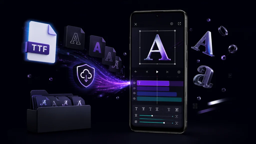
How to Add Custom Fonts in Alight Motion Fonts
The exact interface can vary between Alight Motion Fonts versions and devices, so button names or locations may not always look identical.
A practical workflow is:
- Download a font from a legitimate source.
- Check its licensing terms.
- Confirm that the font is in
.ttfformat. - Extract the file if it is compressed.
- Open Alight Motion.
- Open or create your project.
- Add or select a text layer.
- Open the font controls.
- Import the custom font.
- Apply it to the text.
- Adjust size, spacing, alignment, and other text properties.
- Preview the result and export your video.
If the font does not import correctly, Alight Motion recommends checking that the file is in TTF format and that compressed files have been extracted.
How to Choose the Best for Alight Motion Fonts
The best font is not necessarily the most decorative one. Start with readability, then consider weight, contrast, letter spacing, line spacing, screen size, and video resolution.
Background complexity also matters. A thin font can disappear against detailed footage, while a heavier font may remain visible. Animation speed is another consideration: viewers have less time to read text that appears for only a moment.
Finally, consider your audience and visual identity. Using a consistent typography system across videos can make a channel, brand, or project look more professional.
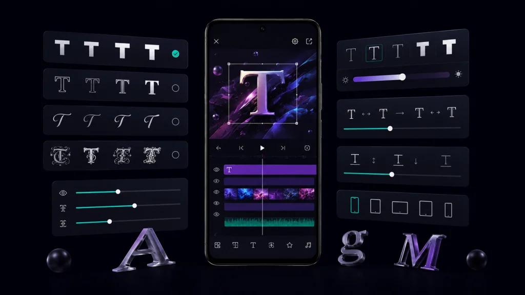
Best Fonts for Different Alight Motion Fonts Editing Styles
Gaming edits: Choose bold or condensed typography that remains visible during fast transitions.
Lyric videos: Prioritize readability and spacing. Script fonts can work for emphasis, but simpler fonts are generally easier to follow.
Cinematic videos: Minimal, condensed, or carefully spaced fonts can complement dramatic footage without competing with it.
Reels and short videos: Strong, readable fonts are useful because viewers often encounter the text briefly on a small screen.
YouTube videos: Versatile sans-serif fonts are suitable for titles, captions, tutorials, and informational content.
Emotional edits: Typography should match the mood without sacrificing readability.
Minimalist videos: Use simple Alight Motion Old Version with restrained styling.
Logo and branding: Select typography that is distinctive but remains recognizable when resized.
Alight Motion Font Effects and Typography
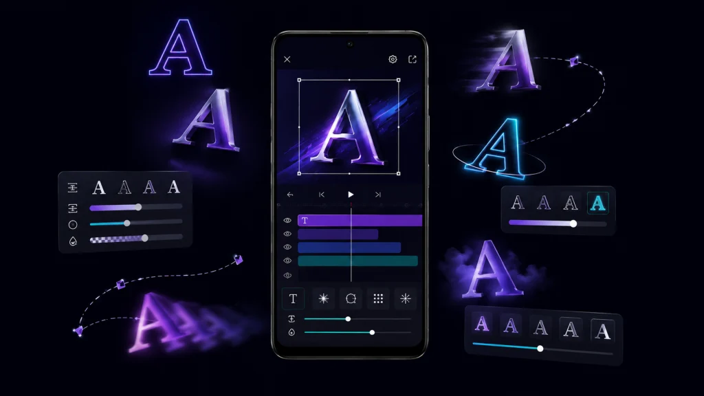
A font and a text effect are not the same thing. The font determines the basic shape of the letters, while effects and animation change how those letters appear or move.
Depending on the design, you can use properties and effects such as stroke, shadow, glow, opacity, position animation, scale, rotation, letter spacing, and text animation.
Use effects to support the typography rather than overwhelm it. For example, a subtle shadow can improve contrast, while excessive glow or animation can make text harder to read.
Font Compatibility Issues in Alight Motion Fonts
Font Does Not Appear
Check that the font was imported correctly and that you are selecting the correct text layer. Also confirm that the file is a supported TTF font.
Font File Will Not Import
If the font is inside a ZIP or RAR archive, extract it first. Alight Motion Fonts specifically recommends extracting compressed font files before importing them.
Font Looks Different
The selected font may have different weights, character sets, or rendering behavior. Compare the original font and imported result using several characters rather than one word.
Special Characters Are Missing
The font may not contain glyphs for every character you are using. Check its character or language coverage.
Non-English Text Problems
Language support depends on the font’s glyph coverage. A font that works perfectly for English may not contain Arabic, Urdu, Hindi, Bengali, Kannada, Tamil, Telugu, or Malayalam characters.
Text Spacing Looks Wrong
Check letter spacing, line spacing, font weight, and the text’s overall size. Different typefaces can require different spacing adjustments.
Project Looks Different on Another Device
Differences can occur between app versions, devices, fonts, or project resources. Always preview the finished project on the intended device or export before publishing.
Alight Motion Fonts for Different Languages
For English, most widely used fonts provide broad Latin character coverage. For Arabic, Urdu, Hindi, Bengali, Kannada, Tamil, Telugu, and Malayalam, you should specifically check whether the font includes the required glyphs.
Language compatibility is therefore a property of the font itself rather than something you should assume from its name or visual appearance. Test the exact text you intend to use before completing the project.
Free vs Paid Alight Motion Fonts
| Feature | Free Fonts | Paid/Commercial Fonts |
|---|---|---|
| Cost | Often free | Usually purchased/licensed |
| Personal use | Depends on license | Depends on license |
| Commercial use | Check license | Check license |
| Variety | Large | Large |
| Support | Varies | Varies |
| Branding | Depends on font | Often broader options |
The important point is licensing. Always read the specific license instead of assuming that “free” means unrestricted use.
Common Mistakes When Using in Alight Motion Fonts
Avoid these common typography problems:
Alight Motion Presets good typography choice should improve the viewer’s experience, not simply make the project look more complicated.
FAQs About Alight Motion Fonts
Final Thoughts
Alight Motion Fonts are more than decorative text choices. The right typeface can improve readability, establish a visual style, and make animated text work better with your footage.
Custom fonts give editors more flexibility, but the best choice depends on the video, screen size, background, animation speed, and audience. TTF is the format recommended by Alight Motion’s official documentation for custom-font importing, while licensing should always be checked separately.
Ultimately, consistency and readability matter more than choosing the most unusual font. A simple, well-spaced typeface with appropriate effects will usually communicate more effectively than an overly decorative design.